

One of the most important parts of your entire inbound and outbound digital marketing strategies for product marketing is the landing page.
Your landing page is essentially the 2022 version of your top sales rep.
If you create a landing page that speaks correctly to your target audience and shows visitors exactly what your company can do for them, you can grow profits exponentially with minimal effort.
In this article, we’ll examine landing pages, how to create a better landing page, improve lead capture, boost conversions, and then apply those strategies to eCommerce and SaaS marketing with real landing page examples.

This is a complete landing page success guide. So let’s get started!
What is a landing page?
If your website is a building, your landing pages are the multiple doors. They are smaller versions of your whole site that funnel the traffic from social media links, any web search or other points of contact. Instead of serving your whole content all at once in one page (like many commercial home pages do), landing pages help you focalize on what a visitor is actually looking for.
Landing page design best practices.
There are so many factors at play that can affect how your target leads will react to your product landing page. UI and UX design is as vital here as in almost every aspect of your business.
How you structure, design, and lead from your product landing page can heavily affect your conversions. You don’t want to be dumping your marketing, advertising and SEO (search enginge optimization) dollars into guiding traffic to a landing page that won’t convert.
We’ve identified the do’s and don’ts to know and apply to create a successful landing page that is your best sales tool: a full list of landing page best practices.

The DOs of landing page design.
Do use a concise, clear H1 header.
You don’t want potential customers confused from the first moment they land on your page. You have mere seconds to make an impact and demonstrate your value to your target personas.
In web lingo, the first section to load in a website is called the fold. The fold is the part of your site that a user can see without scrolling, and if you want them to do so it better be impactful.
What you need is a good headline. The average lead will scan your landing page and determine whether to leave or not within 15 seconds. Your H1 header (also hero or main header) is extremely important for this reason.

You want your statement to quickly let a potential customer know what your product does and why it is valuable to them. It should be no more than one or two phrases.
Your H1 header is also important for focusing on your target keyword and ensuring that search engines index your page strategically.
It’s a don’t to have a vague phrase that isn’t specific about the benefits your product provides. For example, “changing business expensing” is much less powerful than “the easiest way to create and organize expense reports”. Be direct and make your worth immediately clear.
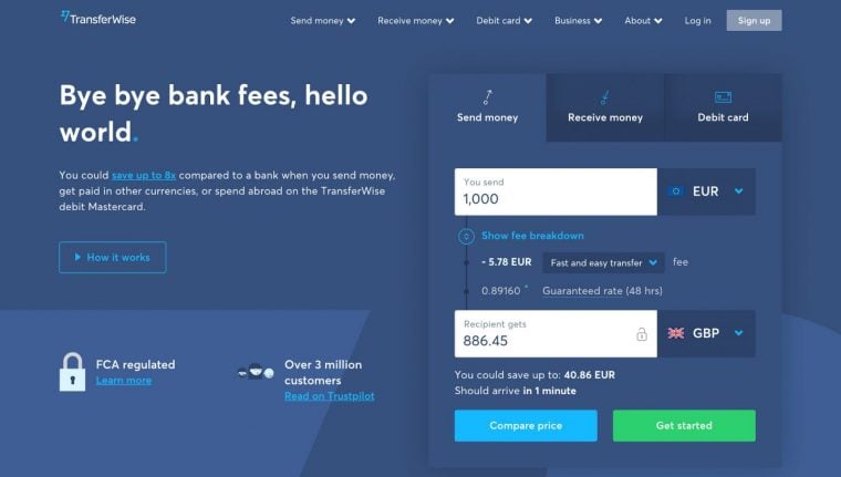
In this old example above from Transferwise (now Wise) they immediately let you know they can help you avoid bank fees and save money on international transfers. In the next example, from their current homepage, they went with a metric (3x) instead to show value.

Do display social proof.
As users become more and more ad blind, are easily able to read through overly “salesy” copy, and have access to hundreds of competitors, using the opinions of your customers has become more important than ever.
Opinions, reviews and testimonials are the most powerful way to convey the image of trust-worthy brand you want your potential customers to have. 92% of B2B buyers are more likely to purchase after reading a trusted review and 88% of customers read online reviews before making a purchase.
People need social proof! They research reviews before purchasing products, especially longer term service-based products like SaaS. Giving this to them on the landing page can help increase your conversion rates significantly.

There are many creative ways to display social proof like reviews, ratings, testimonials and metrics. You can even select comments directly from social media. Here are some real landing page examples of how you could use social proof in your favor:
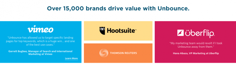
Include reviews written by customers as well as visual ratings like stars or scales. These help visitors quickly determine what you could do for them. You can use the classic combo of image plus review from a satisfied user or from a trusted brand that employs your service. Or you can crate a whole masonry wall of trusted company testimonials like this one from a landing page from Unbounce:
If possible, include video testimonials as social proof. Personal and impactful, video testimonials from real customers with a length between one and five minutes are best. To make sure they do not slow down your site, embed video content from a hosted site, a dedicated video platform, or use a CDN.
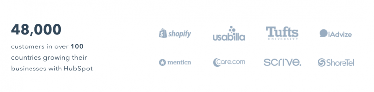
You can also qualify your brand by displaying other customers key metrics like this landing page example from Hubspot:
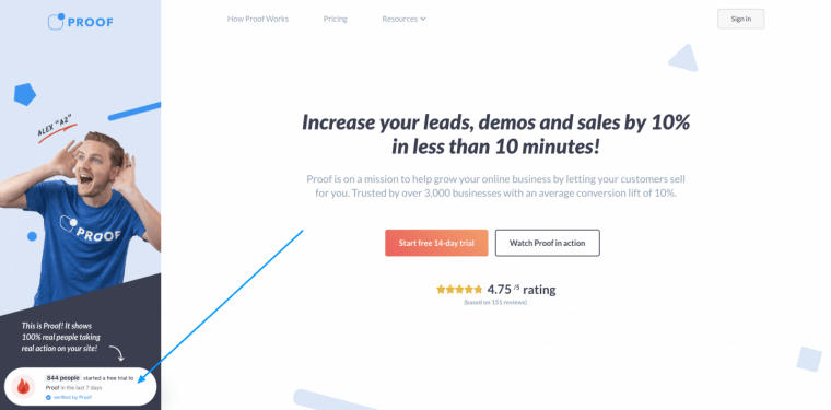
Or you could go a step further and launch real-time social proof notifications on your page using a software like Proof.
Do include clear and frequent CTAs.
You don’t want your customers to need to scroll too long through good info to figure out what to do next. That’s what calls to action or CTAs are for.
A call to action or CTA is a message (can be a couple of words or a whole phrase) that describes an action and entices customers to take such action by clicking on a CTA button or making another kind of input (like filling a form); they usually address users directly.
You surely have seen them before: “read more”, “fill out the form to get a free trial”, or “subscribe to get started”.
Here are some landing page examples on how to improve your CTAs:
- Pick the right colors: Make sure you have clear calls to action with buttons that stand out throughout your landing page. Use colors and style for each CTA button, to make them stand out from the rest of the text and design of the landing page. A clear call to action must be immediately identifiable.
- Position is key: Don’t wait until the end to show your call to action; this can be frustrating and ineffective as many visitors will inevitably quit before arriving to it (even if you have the most exciting and best landing page ever made). You want them to be very clearly the next step after each section and have enough white space around them to not be confused with common text.
- Think the text of you call to action: Never trust in lonely icons what can be conveyed better with words. Use text on each CTA button that gives leads a good idea of what their next step is. For example, instead of “Learn more”, say “Sign up for a free demo now” or “Sign up and start saving time today”. People don’t like to have to struggle to find where to go next or not understand their next action.
- Don’t use just one call to action: A single CTA is not enough. CTAs are versatile and you should use them as frequently as you can. You can also combine multiple CTAs in single design element. For example, if you create a call to action form, make sure that not just the title is a CTA, but also make form fields inviting with CTA placeholders and a CTA button.
Do test what works best.
A/B testing is a great way to search for what marketing strategies are working the best in your landing page. A/B works by creating multiple versions of a single web page, when visitors arrive traffic is redirected to one of those landing pages. By measuring the success of the individual landing pages, you can see what changes to keep and what to throw out.
Use tools like Optimizely or VWO to A/B test different elements on your landing page and determine what is helping you convert the most. It saves a ton of time and money in trying to look on your own what you need to change after a while.
You can A/B test button colors, CTAs, copy, graphics, and more. A/B testing helps you inch closer and closer by making little changes towards the perfect high-converting landing page.

Do announce new updates and features.
Have you ever come across an app or software download that clearly hasn’t had any updates or new features or feedback in months? It feels outdated and like a bad investment, right? You want to show an evolving product and a growing business, not a stagnant one.
It’s common to think of a landing pages as a static website. Sure, a static web page is the easiest one to build, but today, with tools like Unbounce it’s quite easy to build a landing page and make edits whenever you need to.
But what if you could go further? What if you could include new updates and features to show your product’s growth?
Sharing updates and new features in such a visual place like a landing page for leads coming in can do marvels for your brand. It tells visitors your business is growing, keeps them in the loop and looking forward to your evolving product. It turns what could be a static site into a secondary homepage, with all the perks.
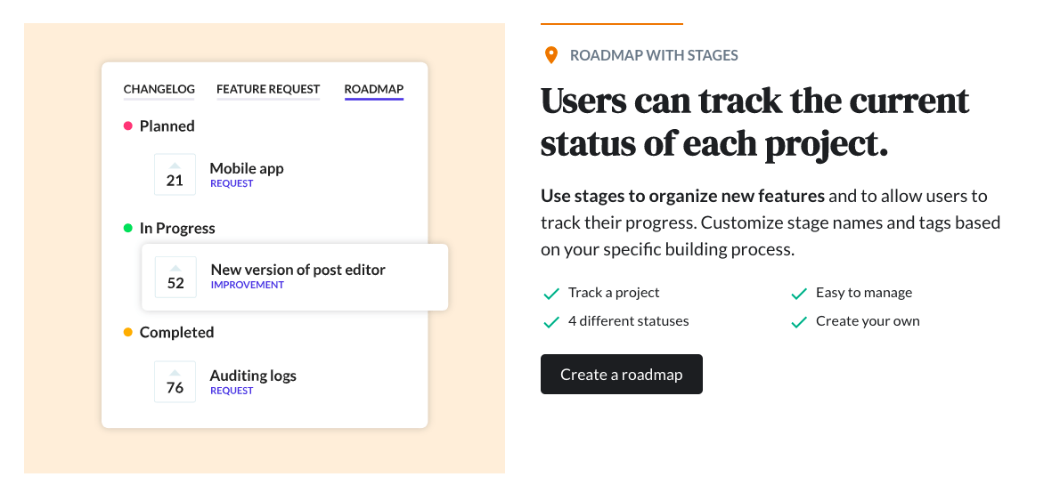
Beamer is a great way to show leads your product is growing on your landing page. One of Beamer’s many features is a newsfeed that sits within your website (or landing page in this case) and can be opened when leads click “What’s New” in the navigation or an icon in the interface. A news feed with updates on anything appears in a discreet sidebar.
Install Beamer to your landing page even if you have already built it, and in a matter of a few minutes. With Beamer, you can post updates for new and upcoming features as if they were blog posts or entries in a changelog. Post photos, videos, and GIFs to better explain visually your updates.
It’s the best way to show progress and coming changes so that leads know they are trusting a brand and team that is working to fit their needs.

The DON’Ts of landing page design.
Don’t trust slow loading media.
This is more technical than creative but a very important point that can be easily overlooked when you want to put together an impressive-looking landing page: don’t use slow loading media at the top of your product landing page.
When a visitor accesses a website their browser need to download its contents. Avoid heavy elements like sliders, videos, and images that are too large and take too long to load at the top of your landing page. This will slow down the overall landing page loading speed, particularly because it’s at the top.
With images throughout the page, you can use lazy loading to improve performance but if you have elements that slows down the page at the top, it’s going to be slower no matter what.
How important is page speed? Very! Despite being a seemingly small detail. A 100-millisecond delay in load time can cause conversion rates to drop by 7%. A few milliseconds slower because of a large piece of media can hurt your conversion rates and even loyal users may unsubscribe if they have a tedious user experience.
If you absolutely must have larger media elements, look into CDN options to keep the page performing well.

Don’t get too long.
Never include long paragraphs of text without visual breaks. It can be really easy to want to spill out as much information as possible on how amazing your company, product or service is on your landing page, but you have to take into account that leads will likely be scanning this page looking for the highlights. Landing pages are not a replacement for your whole website.
Don’t share all of your features at once. Stick the most impactful, popular, and relevant ones for your audience and tailor information around perceived value for your leads. The rest can be solved with links.
You want to visually guide their scanning and direct them to the most impactful information and CTAs, step by step.
Break up paragraphs of text with bullet points, grids, and boxes to better display information and try to finish with a CTA at the end of each section.
Also, try to quantify your results with numbers as much as possible and break up text by showing real people using your product to gain empathy.

Don’t make it too short.
Landing pages are meant to be a condensed version of your offering but stats say they should still be decently long. A general rule of thumb from Neil Patel: “The bigger the ask, the longer the page”.
SaaS products are normally a pretty big ask. You want to make sure customers get the full pitch and it makes sense.
Additionally, the more friction you produce, the more likely it is that you lose customers throughout the process.
You know you will loose some visitors as they scroll more and more, so build potential fallback exits along the way. Exits that lead traffic back to you now or later. Make it easy to get them to sign up, schedule a demo, or input information in a form, so you can ensure that lead as a possibility to convert in the future.
The ideal landing page length, text wise, is between 500 – 1000 words. Landing pages in this range perform the best. You want to add visual elements and break it up with white space as well which all help to contribute to a better conversion rate.

Don’t have just one landing page.
Landing pages, not landing page. You likely have a handful of different customer personas who find your product valuable and you are actively targeting. If you don’t we have a post on how to identify them and build marketing campaigns targeting them.
Don’t count on using the same generic landing page for every persona. Build multiple landing pages that are dedicated to each persona, so you can funnel traffic, and target the features and benefits to better convert them.
You can target specific industry pain points and use different language as well as include case studies and testimonials. Make the products and services featured in your landing page fit with what your desired customer would want or expect.
This has been proven time and time again to highly increase your lead generation and conversion rates. You can use tools like Google Optimize or Proof Experiences to automatically tailor any element on your landing page like headlines, images, call to actions and so much more to fit the specific buyer persona of the visitor.

Using Beamer, you can also segment updates to share upcoming features, post new content, and updates focused or filtered for different personas and types of leads to further customize your landing pages. You customer shouldn’t have to guess whether this product will work for them or think of how to apply it to their process; you should tell them in targeted content and landing pages.
With a couple of great, intuitive landing pages that really resonate with your target leads, your team can build an automated sales converting machine through advertising and greatly help out your sales team in closing deals. A battle-tested digital marketing strategy.
How to create better landing pages for SaaS.
SaaS (or Software as a Service) is an interesting concept that lies perfectly between selling a product and a service; it plays the role of both. You have a product that you are continually improving and adding to, but it also plays an ongoing role in the everyday workflows of users and companies.
Being a very distinctive web space, the SaaS industry, it helps think on specific ways in which landing page marketing can help conversion rate and sales for that kind of business. Here are some tried and tested tips for making a highly converting SaaS landing page.
Communicate your value.
You’ve probably experienced this on a SaaS landing page before. A lot of websites want to put something vague, cool, and creative as top headline, like a mission statement, but this doesn’t help them convert.
The opposite take can also be ineffective. It can be tempting to want to tell users about all the different things your product does and all the cool little features. This can get confusing and overwhelming and leave them questioning: “but what does it really do?”.
If visitors have to spend time trying to figure out exactly what you do, they’ll probably move on.
A real landing page example is Unbounce. They narrow it down in the headline to just a few sentences and they showcase specific benefits, in this case a boost in ROI.
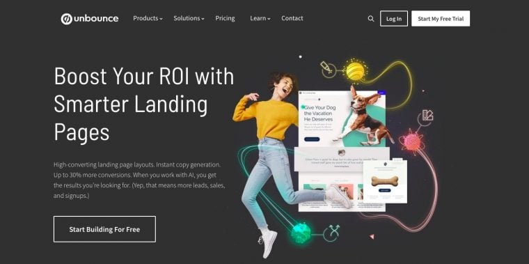
Stick to one short sentence about what your product does, the most important benefits it provides, and leave the complicated details outside the headline and bellow the fold. Visitors should see value within seconds of landing on your page.
Pick a handful of the most relevant and immediately useful features to talk about on your landing page. Represent them visually with graphics that grab attention and help potential users get the gist of what you’re talking about.
Don’t overshare your features, highlight the most immediately valuable.
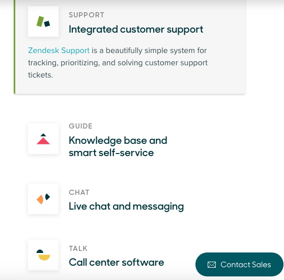
This landing page example from Zendesk, though they have multiple products, is incredibly simple and even includes an actionable CTA:
Appeal to your target audiences.
Once you’ve communicated your value to visitors, you can speak to your target audiences more directly.
Oftentimes, different users in different roles may not immediately see how your product can be used to improve their work specifically. Answer their questions ahead of time and have featured content and copy focused on specific groups you are selling to readily available.
Let’s examine two landing page examples:
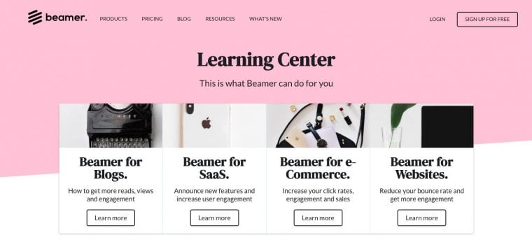
As part of Beamer’s commercial site, we created what we call our Learning Center. This page includes not only links to several user-centric content, but inside the fold we featured four different guides.
The guides are separate industry-specific landing pages that explain customers how Beamer is a great fit for them in particular. It’s an easy way to improve the chances of a conversion. Think of it as a landing page of landing pages.
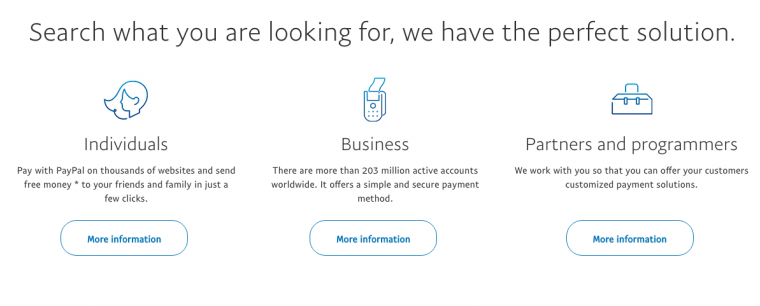
Another landing page example for this strategy is PayPal. They get perfectly specific on their homepage:
Simplify the form.
It’s easy to create CTAs that get lost in the overall look of your page. It may be obvious to you as to where they should be clicking and looking for further instruction but not to someone who is brand new to your page and product.
A lot of the success of CTA buttons has to do with the way our brains work and what makes us subconsciously attracted to taking action. You should use these tips to your advantage.
One of the most if not the most important CTA would be your sign up CTA. That would be the place where you ask your users to fill out the form to start using your service or get a free trial.
- Keep your form fields to a minimum: Try to ask you users just the most vital information you need in the form; just an email address if possible.
- Nothing beats free: Try to include the word free in your form (Sign up for free, start a free trial, subscribe to get a free sample. Free tools and giveaways attract users’ attention.
- Use time to your advantage: Try to also improve CTA buttons by adding a time constraint like for a limited time only or the first 100 users.
- Qualify whenever you can: Just as with testimonials, customers trust what others have already trusted. You can use metrics to qualify an action. For example, 1 million users have already signed up.
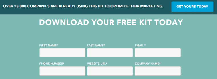
This landing page example from Hubspot offers a free kit and qualifies with the number of downloads:
How to create better landing pages for e-Commerce.
The nature of selling hasn’t changed, just the medium. You don’t need to design and physically put together a beautiful storefront to grab potential shoppers’ attention as they walk by: you need to design a beautiful landing page to capture their attention.
Your landing page and homepage are your new store front. And you’re competing with over three million eCommerce stores operating worldwide. That’s intimidating.
There are hundreds of thousands competing for your target audience’s attention. Here is how to create better converting landing pages for e-Commerce.
Learn to make an offer.
When users get to a landing page, you have just as much time to grab their attention as it takes for them to walk past a storefront, literally. If you do push them to further action in less than 10 seconds, they are likely to bounce and never come back.
Small changes in how you design and present your calls to action (CTA) can have a huge impact on your e-Commerce sales. Everything from the copy on your shop page to the color of the button can make a difference in whether or not people take that next step to purchase.
These shouldn’t be news for anyone involved in marketing. From the ad headline in the printed page, to the promotional video, to the sign in the storefront, descriptive and compelling text incentivize visitors to become customers.

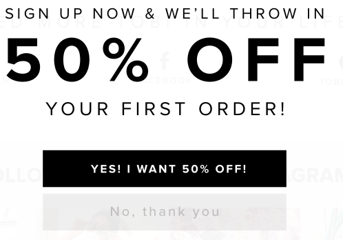
Additionally, don’t assume that people will see the value in taking a desired action; give them an incentive. Even a small reward like “Join us now for a 10% discount” to inspire action can significantly increase conversions. Offer discounts and extra value in exchange for an immediate purchase or even something as simple as an email so you can contact or retarget them later.
Anytime you start a new e-Commerce marketing campaign be it for a sale, offer or limited time drop, instead of taking your visitors redirect traffic to dedicated landing pages that can do the sales pitch better.
Personalize customer experience.
Increasing personalization where you interact with potential customers can help increase spending by 500%. That’s a huge potential boost in sales to miss out on if you are not putting any effort towards making your landing pages more personalized and relevant.
There are limited ways to do this if these are new visitors coming in to your website but you can segment the content they see to match their interests. Give every visitor what they are looking for.
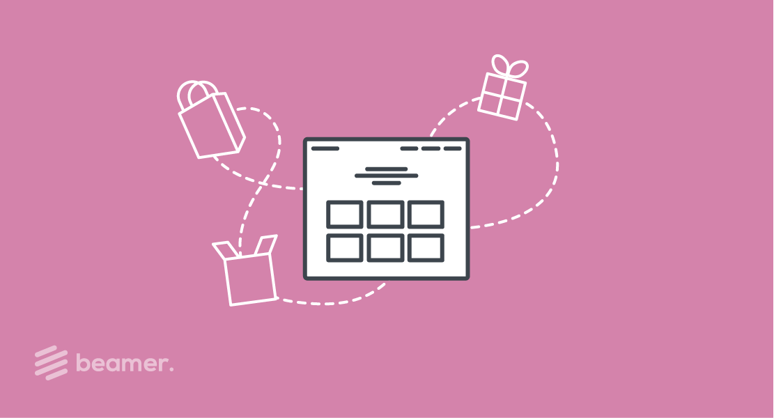
Using Beamer’s newsfeed feature, you can create a stream of offers, updates, deals, benefits, and products, tailored to each user based on their location, language, search patterns, and past behavior on your site if they have visited before.
It’s an easy way to further engage and personalized your landing page. The best part is Beamer integrates right into your site interface so you never have to change the landing page, just the Beamer updates you want to.

Offer helpful information and more to explore.
There should always be a plan B for your e-Commerce landing page if your potential customer doesn’t bite and make a purchase.
In fact, 92% of people who come to your website for the first time are not there to make a purchase and will not. They are trying to figure your company, brand and products out.
You want to keep them engaged and get a way to contact and retarget them in the future to push them to the point of purchase down the line.
Qualify your brand as authoritative by providing helpful and interesting content for users. Use Beamer to present them with other products, content, updates, and more to explore in one feed right within your landing page.
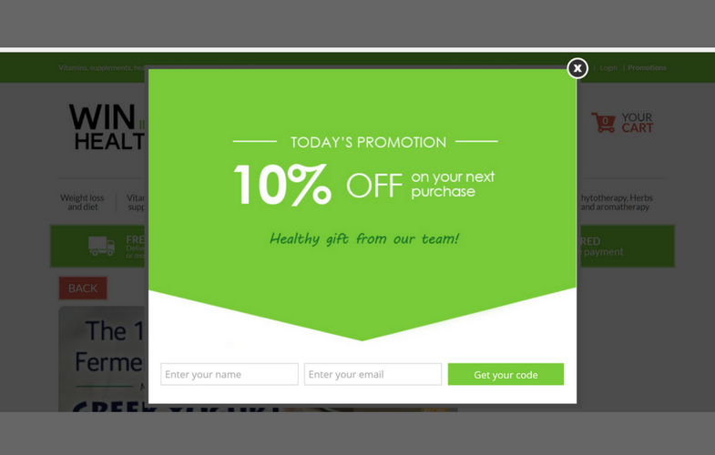
Add CTAs to get them clicking through your site or catch their attention with notifications using Beamer’s boosted announcements that allow you to provide your visitors with enticing floating cards, offers as bars at the top of your page or even modal windows with catchy headlines and links that take your visitors directly to the checkout page.
Additionally, always push visitors for a way to collect information so you can retarget and convert later on. Try OptinMonster to add well-timed exit popups to your landing pages to catch those potential shoppers!
Your landing pages are your 15 second pitch to your visitors. If you engage them right away with these tips and tricks, you can make 15 seconds turn into recurring monthly revenue.
Making slight changes like these to your landing pages can result in many more conversions in the long run for minimal effort. Think of every page on your website like a landing page and boost engagement and sales.
If you’re looking for a marketing tool to take your landing pages to the next level, search no more and think of Beamer. Try Beamer on your landing pages for free today.