

Beamer offers appearance customization directly from your settings page in the Starter, Pro and Scale plans. You can change the colors to fit your site with no special skills required, using an array of color pickers. Easy and straightforward. But what if you want to go beyond that? What if you want to change something that’s more specific or not included in the default appearance customization? Then you can always count on custom CSS, available for Pro and Scale users.
In this tutorial you’re going to learn what is custom CSS and some common ways our users like to use it to customize their Beamer’s appearance to fit their brands UI.

What is CSS?
CSS (Cascading Style Sheets) is a language used for design customization and presentation of documents in the internet. Alongside HTML and JavaScript is one of the most common languages used in the World Wide Web. To use Beamer’s custom CSS you’ll need at least a basic understanding of CSS or to consult with a coder or designer that can help you translate the appearance changes you want to make into the CSS language.
What is custom CSS and how to use it in Beamer? pro and up
Custom CSS is a special feature available for our Pro and Scale users. With custom CSS you can add your own CSS code to change the appearance of your Beamer widget to fit your site perfectly. The custom CSS will overwrite Beamer’s default styles on the widget.
How to use custom CSS in Beamer?
- Write your own CSS code to customize the appearance of your Beamer widget.
- Go to your Beamer dashboard and open the Settings page.
- Go to the Appearance page and scroll to the Custom CSS section.
- Copy your custom CSS code and paste it in the provided input (don’t add the <style> tags you would use in HTML, just plain CSS code).

- Click save to keep your changes.
- Voilà! Your new customized styles will be applied to your Beamer widget.
Useful tips and demonstrations
Here are some of the most common ways our users like to use custom CSS in their Beamer widgets.
How to change your Beamer widget font?
The easiest way to change the font of your Beamer is to call one from Google Fonts. Pick a font and open the Selected menu. There you’ll find a standard and @import option. Pick @import. We’re going to use the font Roboto as an example.
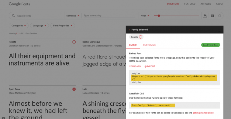
- Copy the URL provided by Google Fonts (ignoring the <style> tags) for example this one:
@import url('https://fonts.googleapis.com/css?family=Roboto&display=swap'); - Copy the font definition provided by Google Fonts, for example this one:
font-family: 'Roboto', sans-serif;
- Place the definition into a CSS valid expression to overwrite Beamers default font. Don’t forget to add !important to make sure it will. Your code should look similar to this:
@import url('https://fonts.googleapis.com/css?family=Roboto&display=swap'); body, body * {font-family: 'Roboto', sans-serif !important;} - Paste your final code into the Custom CSS section of your Beamer dashboard, in Beamer > Settings > Appearance.
- Done! Your Beamer widget should have your new font instead of the default one.
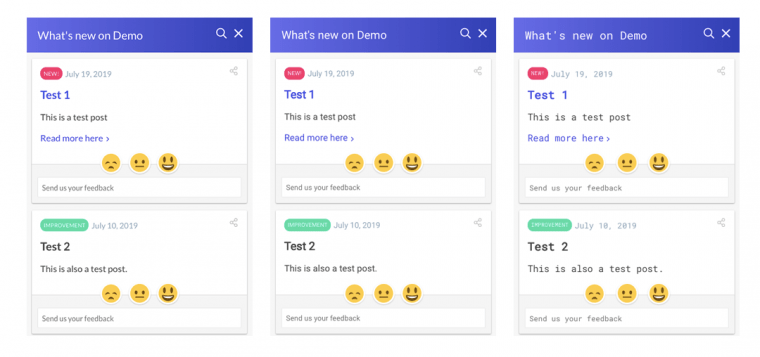
Widgets with fonts Lato (default), Roboto and Roboto Mono.
If you don’t want to use Google Font and prefer to host your fonts on your own server, or use another web font service just change the URL on step 1 for the one you prefer.
@import url('YOUR_OWN_URL');
How to change the appearance of posts?
Posts are individual div elements with the class .feature and are contained in a single shared feed (div.news). You can change the appearance of posts by adding new CSS rules to the .feature class and its children. As a demonstration we’ll be creating a minimal console-inspired Beamer widget by adding a Custom CSS.
This is the code used:
/* This will change the font in the entire widget */
@import url('https://fonts.googleapis.com/css?family=Roboto+Mono&display=swap');
body, body * {font-family: 'Roboto Mono', monospace !important;}

/* This will change the background color of the feed */
.news {background: black !important;}

/* This will change the appearance of the post boxes */
.feature {
box-shadow: none !important;
border: 1px solid white;
border-radius: 0 !important;
background: black !important;
color: white !important;
font-size: 13px !important;
}

/* This will change the appearance of the post date */
.feature .featureDate span {
color: white !important;
font-size: 12px;
}

/* This will change the apparance of the title */
.feature .featureTitle {margin-bottom: 10px !important;}
.feature .featureTitle a {color: white !important;}

/* This will change the appearance of the category tags */
.feature .category {
background: transparent !important;
border: 1px solid;
border-radius: 0;
font-size: 12px;
}

/* This will change the appearance of the post link */
.feature .featureAction a {color: white !important;}
.feature .featureAction svg {fill: white !important;}
The code is commented to let you know what each part does. You can find many other ways to modify your widget by looking into the elements inside .feature (sometimes you’ll need to use !important to overwrite some specific changes).
We combined that custom CSS with some basic appearance changes in the Beamer settings page and here you can see the difference:
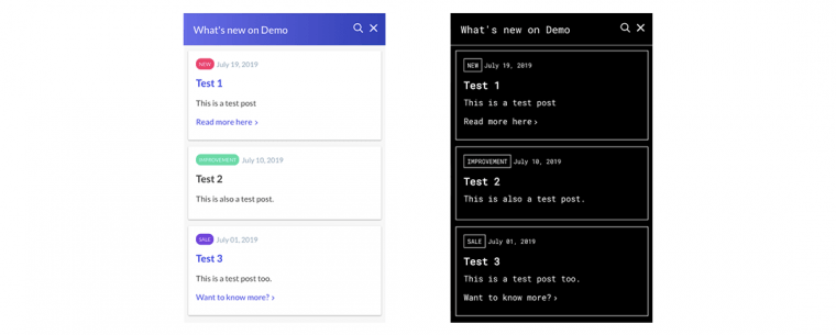
The original widget and a custom made console-inspired widget
How to change the appearance of the post content?
To change the appearance of the content of the posts just look for the classes inside .feature. As an example we will give the post an appearance reminiscent of a newspaper by just modifying two classes. This is just an example of the many things you can do by adding custom CSS.
- We are going to call an external font for our newspaper headline from Google Fonts.
@import url('https://fonts.googleapis.com/css?family=DM+Serif+Display&display=swap'); - Next we’re going to style it to pop more by changing the title font and increasing its size modifying the .feature h3.featureTitle element:
.feature h3.featureTitle, .feature h3.featureTitle a { font-size: 40px !important; font-family: 'DM Serif Display', serif; font-weight: normal; } - Finally, we’re going to change the size, line-height and font of the content text to a common serif font (Georgia) that will look more like a newspaper or book modifying the .feature .featureContent element:
.feature .featureContent, .feature .featureContent p { font-family: 'Georgia', serif !important; font-size: 14px; line-height: 1.8; } - Copy and paste the final code into the Custom CSS section of the Beamer settings page. The final code should look like this:
@import url('https://fonts.googleapis.com/css?family=DM+Serif+Display&display=swap'); .feature h3.featureTitle, .feature h3.featureTitle a { font-size: 40px !important; font-family: 'DM Serif Display', serif; font-weight: normal; } .feature .featureContent, .feature .featureContent p { font-family: 'Georgia', serif !important; font-size: 14px; line-height: 1.8; } - Done! We have our newspaper inspired widget.

How to change the appearance of the feedback icons / reactions emojis?
Just as any other change you want to make, you need to find the selectors involved in that specific area. For feedback icons that would be everything inside the .featureFeedback class.
- Hide the img with the current icons (with a display: none).
- Modify the containers to have the desired size and position.
- Pick your favorite alternative icons and upload them somewhere (save the URLs).
- Add the new images as background.
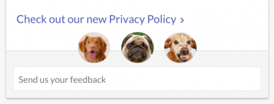
/* Hide the current icons */ .featureFeedback .emojis img { opacity: 0 !important; height: 100% !important; width: 100% !important; margin: 0 !important; } /* Create a place for the new icons */ .featureFeedback .emojis span {background-color: #fff; background-position: center center; background-size: cover; background-repeat: no-repeat; display: inline-block !important; border-radius: 50%; margin: -6px 6px 0; -webkit-transition: all .25s ease; transition: all .25s ease;} /* Handle hover action */ .featureFeedback .emojis span:hover {cursor: pointer; opacity: 0.8;} /* Add new icons */ .featureFeedback .emojis span:nth-of-type(1) {background-image: url('YOUR_IMAGE_HERE');} .featureFeedback .emojis span:nth-of-type(2) {background-image: url('YOUR_IMAGE_HERE');} .featureFeedback .emojis span:nth-of-type(3) {background-image: url('YOUR_IMAGE_HERE');} /* Add the visual feedbacks */ .featureFeedback .emojis span.unselectedemoji {-webkit-transform: scale(0.8); transform: scale(0.8); -webkit-filter: grayscale(100%); filter: grayscale(100%);} .featureFeedback .emojis span.selectedemoji {} - Enjoy your new icons. Our example has doggos!
What other classes can I modify?
With custom CSS you can modify any class inside the widget you would like. Here’s a list of the most important:
.header /* The entire header bar */

	.headerTitle, .headerTitle a /* The header title */

.news /* The container of the posts */

	.feature  /* This is the post box */

		.feature .featureDate /* The section that includes categories and date */

			.feature .featureDate .category /* The post category */

			.feature .featureDate span /* The post date text */

		.feature h3.featureTitle, .feature h3.featureTitle a /* The post title */

		.feature .featureContent, .feature .featureContent p /* The post content */

		.feature .featureAction /* The post custom link */

			.feature .featureAction a /* The link's text */
			.feature .featureAction svg /* The link's arrow */
What about standalone?
When you add a custom CSS code it will be embedded both on your widget and standalone page. We added special classes to the HTML body to signal what kind of feed is being shown. You can use those classes as parent to affect only one of the versions of your Beamer feed use the following classes.
body.embed {} /* this class is for the default Beamer widget */

body.embed.popup {} /* this class is for the special widget with display "popup" */

body.standalone {} /* this class is for the standalone page */


/* EXAMPLES --------------------------------------------- */

	/* 	This code will make your standalone title huuuuge */
	body.standalone h1.headerTitle {font-size: 40px !important;}

	/* 	This code will paint your widget's background aquamarine */
	body.embed .news {background: aquamarine !important;}
How to have multiple CSS templates?
With Custom CSS you can have multiple themes with different styles and use them in specific circumstances. This is done by a special class that will be added to the <body> tag of your Beamer widget. You just need to link the specific theme styles to that class and call it when you need them in your embed code.
- Think in a name for your theme. The name should be able to be called as a CSS class so you can’t use spaces but you could use dashes (-) or camel case (camelCase). This name will be your theme class. For example dark, compact, extended, awesome-theme, newTemplate.
- Add to your custom CSS your theme styles prefixed with the theme class. See the next example:
/* This will change the color of the post titles to aquamarine */ .featureTitle a, .featureAction a { color: aquamarine !important; } /* This will change the color of the post titles to aquamarine but only for theme 'aqua' */ .aqua .featureTitle a, .aqua .featureAction a { color: aquamarine !important; } - Call your theme only when you need it by including the parameter ‘theme’ in you Beamer Embed Code. You can learn more about the embed code here. The parameter value should be your theme class or name.
<script> var beamer_config = { product_id : '************', theme: 'YOUR THEME CLASS' // This is the class that will be added to the widget's body to identify the theme }; </script> <script type="text/javascript" src="https://app.getbeamer.com/js/beamer-embed.js" defer="defer"></script> - Each time you call the theme parameter it will be added to the body tag of your Beamer widget and your custom theme styles will take effect.
