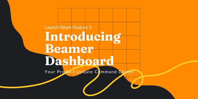
🎉 Now, for the final feature of Launch Week! We give you the Beamer Dashboard:
Learn More
🎉 Now, for the final feature of Launch Week! We give you the Beamer Dashboard:


Mariano Xerez.
May 12, 2021
There's a myth among some SaaS companies, especially the smaller ones, that user experience can be overlooked if the budget is not enough to cover it properly. Sometimes the tasks of developing UX or even UI may fall in the hands of engineers or backend developers (great people for sure but not the best suited for this task). Or even worse, not be considered at all.You may be tempted to think that you have a killer product that can be profitable by itself and it doesn't need the bells and whistles of a carefully thought user interface and experience. But even if your product can do great things if your users can't understand how to use it correctly or are constantly annoyed every time they do, they will leave. According to some metrics, 88% of online consumers are less likely to return to a website after a bad experience and at least 17% of startups fail for not accounting for great user experience.

Let's begin with a personal anecdote. Years ago my mother got a new job. As she is the opposite of tech-savvy I prepped her in advance to improve her basic computer skills. She learned with just a few lessons. But on her first day at the new office, I got a phone call early in the morning. "I don't know how to turn the screen on," she said whispering.She was embarrassed because even though she had mastered all the basics in just a few weeks, turning the screen of a computer on should have been even easier than the basics! Well, I calmed her down and asked the usual questions: does it have a light? Does it have a power icon? can you feel a button on the top, side, back, or bottom of the screen? is it plugged in? I thought she was nervous. So to solve the issue quickly I asked for the maker and model of the screen and then googled it. To my surprise, it wasn't my mother's computer skills nor her nerves! It was unbelievably bad design.

Even though user interface and user experience are not exactly the same, the first is a very important part of the latter. If your users don't understand how to use your tools they're going to have a bad time (like my mum). And if you run a SaaS company that will probably mean that your customers will not stay for the long run. Or that just the most advanced users that know how to find answers by themselves will stay, but not very happily. Sorry.
Since we first launched Beamer we usually get positive feedback about our interface. Many of our customers say that our product is intuitive and easy to use.
When users sign up they are showing interest in your product, but that doesn’t mean they have become loyal time customers yet. There’s a journey ahead with many possible early exits. That’s why the first step should never be an obstacle. Sign up must be frictionless, something so easy to do that a lead will not hesitate to start the process.When designing a signup form, try not to ask for too much information. Ask just what you need to set the account and leave the extras for later. If you still want to add some extra steps like invites or social media sharing, make them skippable! Each additional stage between the first click on the signup button and the full experience of your product can be perceived as an obstacle by your users.

Your user needs to know what they are doing and that they are doing it right, even if they have signed up for hundreds of services before. Guide them using clear and enticing call-to-actions. Track their advance with steps, progress bars, or both.After the sign-up is completed, or even during the process, you may help your users understand your product better with some useful tips. Make sure that after your onboarding process, your users will be ready to start working with your product immediately.Use the onboarding process not just to welcome your users, but to show them what your product can do. You can add virtual tours, explanatory tooltips, quick video demonstrations, tutorial recommendations, or highlight specific features. You can also personalize the onboarding process using the information the user is sharing with you to make it more specific to their needs. For example, call them by their names, create multiple onboarding paths, or highlight different features depending on the type of user.
If your users are churning very early it may be due to a poor experience during the signup or onboarding process and you need to fix that! A bad first impression is hard to shake.

You don’t need me to tell you that your product needs to be easy to use. A good user experience depends on that! But even if you’re building complex tools with lots of features there are always ways to help your users adopt and take full advantage of them.User experience is fundamental to keep your users engaged in the long term. Usability is not just about the features, but the way your users interact with them, how they feel about them.For example, users may get frustrated if they don’t understand how to use certain features. Providing good and multiple support channels is an excellent method to improve user experience. That way even if your users find an obstacle they will be able to overcome it quickly enough to keep them engaged.

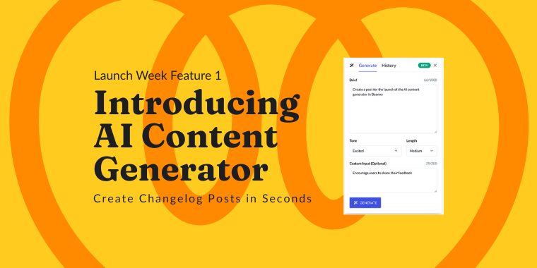
Feature discovery is also vital. If your product is constantly updated (as most SaaS companies do) you need to let your users know. If you launch a new feature or improve a current one, many of your users may never even notice if you don't report it.Think of Beamer, a fully customizable and easy to use changelog that can be embedded directly in any app or website. You can publish updates or release notes with Beamer to keep your users informed about all the improvements in your product. Catch the attention of your users with images, gifs and videos, gather feedback, and use a full suite of tools to segment and target your audience to maximize engagement.

Another way to improve the user experience that gets generally overlooked is translation. More than 70% of the world doesn’t speak English, and even though it’s the main language of the Internet (more than half of all websites are in English), consumers spend most or all of their time on websites in their own language.Surveys say that 72.4% of consumers would be more likely to buy a product with information in their language and nearly one in five Europeans never browse in a language that’s not their own. By translating your product, and using localization to adapt it to different cultural sensibilities and local trends, you can open the door to wider markets and emerging economies.
Providing a good user experience can’t be achieved all at once or in a single attempt. Just as your product is probably changing and updating, the user experience needs to improve constantly too. By measuring the engagement and frustrations of your users, you take an informed and data-driven approach to UX improvement.Think about this: what better way to understand user experience than to listen to your real user’s experiences? Comments, reactions, likes, views, clicks, interactions, and other kinds of feedback are excellent tools to measure user engagement and user experience.There are many ways to open spaces to receive feedback from your users, but not all can seamlessly integrate into any product. Also reading through thousands of comments may be overwhelming for some teams.That’s why metrics like Net Promoter Score (NPS) are very handy. It’s a simple way to measure the enthusiasm and loyalty of a customer and will let you identify immediately who’s a promoter (a high scorer) and who’s a detractor (a low scorer).

In that regard, Beamer is a versatile tool to measure engagement. With Beamer, your readers can post comments on each update, and react to them. You can respond directly to their comments and track engagement with analytics to keep improving their user experience.

With Beamer, you can also embed NPS surveys. That will let you not only measure the enthusiasm of your users but also interact with both promoters and detractors. You can contact your loyal customers to increase their enthusiasm even more with private demonstrations of new features or pre-releases. And you can track your detractors to understand what part of the user experience is not working properly, fix it, and then change their minds.A good user experience is a definite must for any SaaS product, and will ensure a smooth customer journey and long-time engagement. For a great way to improve SaaS user experience, drive new feature adoption and collect feedback, try Beamer today.
This article is about Customer Engagement + customer feedback + Product Management + User Engagement + User Feedback


“Beamer is the perfect tool for SaaS companies to engage users and reduce churn. Beamer has helped us achieve huge improvements in click through rates, reductions in churn and increased upselling.”
Benny Waelput
Go-to-Market Marketeer