Help Center

Everything you need to know about getting started with Beamer

How to customize in-app notifications? 

Beamer offers a great amount of customization options, including an easy-to-use Appearance settings page and Custom CSS insertion (from the Pro plan and up). These personalization features include the in-app notifications like snippets, topbars, tooltips and popups. In this article we’ll teach you how to customize those notifications.

Be aware: These personalization may require a basic knowledge of CSS coding. If you don’t know how to do it, please consult with your company developers.

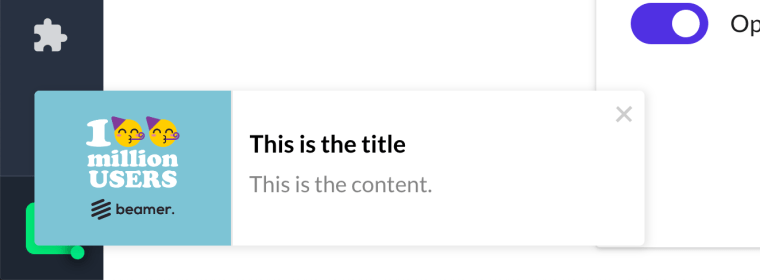
In-app notifications: Floating notifications.

Snippets, topbars and tooltips are generated directly in the DOM so you can personalize them by directly adding CSS code to your page or app styles. Write your personalized CSS code but don’t add it through the Custom CSS feature, instead just include them in your style css sheet or with a <style> tag in the DOM.

Snippets.

Snippets are contained in an element with the .beamerAnnouncementSnippet class and have two main parts: a thumbnail and a content block. Here’s a list the CSS classes included in a snippet, you can change their properties however you’d like. Try always to use !important to make sure your styles overwrite the default styles.

.beamerAnnouncementSnippet { /* this is the snipper element */ }

	/* Snippet Thumbnail */
	.beamerAnnouncementSnippetThumb { /* this is the thumbnail container */ }
		.beamerAnnouncementSnippetThumb img { /* this is the thumbnail image */ }
	
	/* Snippet Content */
	.beamerAnnouncementSnippetContent { /* this is the snipper content block */ }
		.beamerAnnouncementSnippetTitle { /* this is the title */ }
		.beamerAnnouncementSnippetText { /* this is the excerpt text */ }
		.beamerAnnouncementSnippetClose { /* this is the close icon */ }

Beamer snippet example

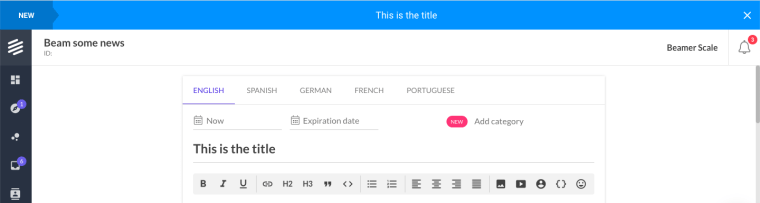
In-app notifications: Topbar.

Topbar in-app notifications are contained in an element with the .beamerAnnouncementBar class and have two main parts: a category and a content block. Here are the CSS classes included in a topbar. Remember to use !important to make sure your styles overwrite the defaults.

.beamerAnnouncementBar { /* this is the bar element */ }
	
	/* Category Block */
	.beamerAnnouncementBarTag {}
		.beamerAnnouncementBarTag span { /* this is the category text */ }
		.beamerAnnouncementBarTag:after { /* this is the category block tip */ }
	
	/* Content Block */
	.beamerAnnouncementBarContent {}
		.beamerAnnouncementBarText { /* this is the bar text */ }
		.beamerAnnouncementBarClose { /* this is the close button */ }
			.beamerAnnouncementBarClose svg { /* this is the close icon */ }

in-app notifications Beamer topbar example

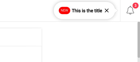
In-app notifications: Tooltips.

Tooltips are compact floating notifications contained in an element with the #beamerLastPostTitle. These are the CSS classes included in a tooltip. Don’t forget to use !important to make sure your styles overwrite the defaults.

#beamerLastPostTitle { /* this is the tooltip element */ }
	
	/* Tooltipo Content */
	#beamerLastPostTitle .beamerCategory { /* this is the category tag */ }
	#beamerLastPostTitle .beamerTitle { /* this is the text */ }
	#beamerLastPostTitle svg { /* this is the close icon */ }

	/* Tooltip Tip */
	#beamerLastPostTitle .popper__arrow { /* this is the tooltip tip */ }
		#beamerLastPostTitle .popper__arrow:before {}
		#beamerLastPostTitle .popper__arrow:after {}

Beamer tooltip example

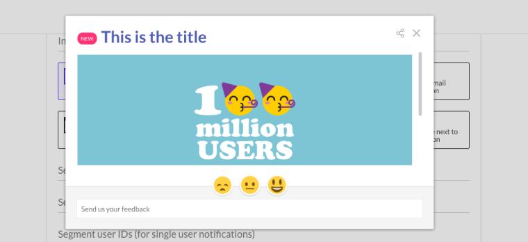
How to customize popups?

Popups unlike the other in-app notifications are inserted as iframes into the DOM. That means that you can’t target them with CSS inserted directly in your style sheet or via <styles>. But you can personalize them with Custom CSS. To customize your popup notifications:

  1. In your Beamer dashboard go to Settings (settings) and then Appearance (palette).
  2. Scroll down to the Custom CSS section.
  3. Write your CSS code in the text area or paste your personalized code there.
  4. Click on Save Settings to keep your changes.

To target the popups use the following classes in your CSS code:

.popup .feature {}
	.popup .featureDate .category { /* this is the category tag */ }
	.popup .featureDate span { /* this is the date (hidden by default) */ }
	
	.popup .featureControls { /* this is the social media share action */ }
		.popup .featureControls .social {}
	
	.popup .featureTitle { /* this is the title */ }
		.popup .featureTitle a { /* this is the title link */ }
	
	.popup .featureContent { /* this is the conent */ }
	
	.popup .featureFeedback { /* this is the feedback block */ }
		.popup .featureFeedback .reactions { /* this is the reactions block */ }
		.popup .featureFeedback form { /* this is the comments block */ }

in-app notification

Your Data Security and Privacy is our Priority.

At Beamer, we care about our customers’ data and this is how we protect it.

Read our Terms of Service

vpn_key Data Ownership

Your account and data belongs to you and will not be sold in any case. We can delete your account and data upon your request. Learn more chevron_right

lock Encryption

Beamer data is encrypted in transit (advanced TLS protocols and 2,048-bit keys or better) and at rest (using AES 256 encryption with integrity).

dns Access

Customer data is always backed up and uptime is over 99.9%.

workspace_premium GDPR

Beamer is GDPR Compliant and has the Data Processing Agreements in place. Learn more chevron_right

bug_report Penetration testing

Third party network, application and physical security tests are conducted regularly. Learn more chevron_right

Keep your users in the know!