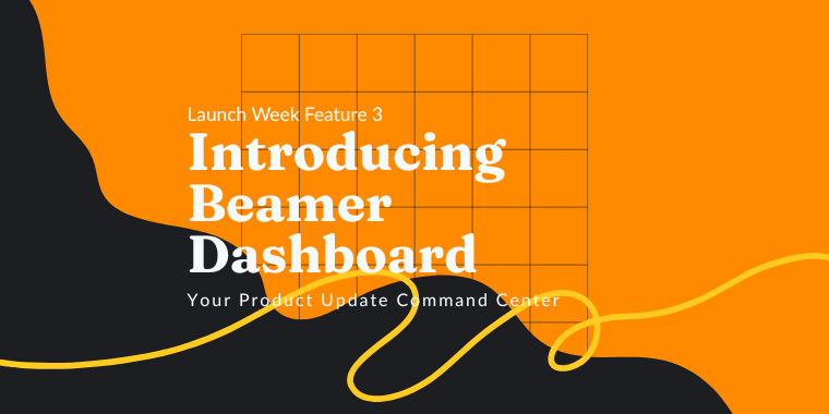
🎉 Now, for the final feature of Launch Week! We give you the Beamer Dashboard:
Learn More
🎉 Now, for the final feature of Launch Week! We give you the Beamer Dashboard:


Spencer Coon
August 23, 2018
SEO feels like a complex, always changing code that everyone online is trying to crack. Reaching a profitable place in Google Search is so sought after, there is no room for error in your effort. You can be spending a large budget on ads and nailing content strategy and driving a ton of traffic but if you don’t have an engaging and valuable interface for those users, they will bounce and Google will dock you for it. Your user interface is actually incredibly valuable in your web ranking and keeping your site authoritative in the eyes of Google.

When the traffic you work hard to drive reaches your site, if they are greeted with a well organized, engaging, and interactive page, they will spend more time, dropping your bounce rate, and boosting your ranking. It doesn’t have to be a huge job for developers, either.
Your CTAs should are ultimately how you’re going to guide traffic through your site and get users to take the desired actions you want them to. They should be both strategic and creative as well as intuitive for users. It’s quite important that they are. Users clicking through to another page keep users on your site for much longer and lead them to what they’re looking for; a conversion for you. Luckily, there is a ton of research on CTAs and sure fire ways you can try. A lot of the time it really boils down to very simple design changes. You should aim to use descriptive and emotion-evoking words within your CTAs instead of just ‘Join Now’ or ‘Click Here’. Instead, use ‘Join for free today’ or ‘Sign up and get more’. There should be value and urgency communicated. In terms of actual design, there are certain colors that statistically work better than others such. Typically, the color should heavily contrast its surroundings. Blue is a general favorite but red does better when most of the page is blue or blue tones. CTAs should also obviously be the next step. Buttons should be clear and placed in the right context on your page.

Especially if your site is an ecommerce site or there is a sales process you’re trying to guide, your interface should be helping to answer new traffic’s questions ahead of time and breaking down the barriers to further engagement (purchase). Offer more information in appropriate places whenever you can. For example, if you’re describing the features of your product, add buttons or links to further examples of how users can take advantage of these features. Anytime users get to the end of a section, page, or piece of content, have a direction for them to move forward. For example, direct them to more information, another related piece of content, to take a desired action like contacting you or signing up; never just leave them to click around and figure it out themselves. You can really quickly cover the bases by adding CTAs for the desired actions you want traffic to take to a sticky footer that appears under every page and post no matter what. It’s simple but eliminating and questions can make a big difference.

Don’t assume users are as knowledgeable as you and know where to go and where to find the parts of your site that match their interests. Always be readily offering suggestions and showing them what else is on your site. There is no point in having a ton of other interesting content and helpful information if they will never get to it on their own. You can do this with simple suggestions in the sidebar or your footer. You can get pretty smart with these and have them be predictive and personalized for users based on their past behavior on your site. AddThis is a super easy content recommendation tool you can use to suggest other page and content on your site to users exploring based on what you already know they want to see. You take the guesswork out for them and keep them on your site for longer.
This is an old trick but it’s always worth mentioning. If you’re going to prompt traffic to click through to a quick update, signup page, or other not-so-important page, always have it open as a new tab. Having a second tab open will do two things: it will increase the time spent on the homepage or the landing page clicked away from and if users close out of the new page they navigated to, they are still on your site on the other tab and you haven’t lost them completely. It’s so simple and can be really helpful for the technicalities on your bounce rate and users exploring your site.
Data around social media actually holds a lot of weight in terms of what gets users attention and keeps it. Posts that include intriguing videos and photos get over 300% more views and shares. It translates to content and web pages. Articles with images get 94% more total views! Including appropriate photos, graphics, and videos on your landing pages and within your content can make a drastic difference in how much time users spend on your pages and how quickly they bounce away.

Getting news users to explore out of the landing page they come in on has long been one of the hardest things. Most traffic bounces from the landing page. Beamer makes it easy to engage users with more from any page they come in on. Beamer is a simple newsfeed that sits right within the interface of your site. All users have to do is click a ‘What’s New’ or icon in your interface to open up a feed full of updates on anything you want. You can create updates for new posts, new announcements, deals and offers for e-Commerce sites, etc. You can create visually engaging updates using screenshots, images, and videos along with CTAs to continue to click through to your site. You can even segment updates for the individual users’ language, location, demographics, and past behavior on your site to better engage them. For example, for returning users, you can suggest content they will like or have news updates for them as opposed to new users who you can show more introductory information and prompt to explore other areas of your site. This is particularly helpful if you get a ton of organic traffic in from blog posts but don’t see a lot for that traffic moving to other pages. You can use Beamer to boost engagement no matter what post they come in on. Read more on how you can use Beamer to boost blog traffic.

With just a few of these relatively simple changes, you can see a big difference in your bounce rate across landing pages on your site and boost engagement to, over time, increase your google ranking. In the short run, you can better convert the traffic you’re working so hard to drive to your site. You can’t afford not to consider these tips! For a way to better engage users anywhere on your site, install Beamer in seconds today.
This article is about Customer Engagement + customer feedback + Product Management + User Engagement + User Feedback


“Beamer is the perfect tool for SaaS companies to engage users and reduce churn. Beamer has helped us achieve huge improvements in click through rates, reductions in churn and increased upselling.”
Benny Waelput
Go-to-Market Marketeer