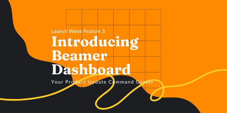
🎉 Now, for the final feature of Launch Week! We give you the Beamer Dashboard:
Learn More
🎉 Now, for the final feature of Launch Week! We give you the Beamer Dashboard:


Mariano Xerez.
February 10, 2021
Release notes are announcements published to notify users about the launch of a new service, feature improvements, bug fixes, or product updates. This kind of post has the goal of letting your users know what's new and what has changed. In this post, we gathered out best-performing release notes examples and templates.Release notes don't replace tutorials, product showcases, or documentation. They give your users the minimum amount of information necessary to grab their attention and invite them to see the improvements for themselves or read more. In the past, we have published posts about how to write better release notes for SaaS. This time, we want to give you some templates and examples based on how we write our own.
Just replace the text in {{brackets}} with the name of your new feature or with what it does, and you'll be golden:
We know users don't spend too much time in each post while scrolling for feature updates, so we introduce the feature directly in the title. For example, Boosted announcements launched⚡️. We try to keep it simple, clean, and to the point. And we like emojis (a lot! 🐱🐱🐱). You can use our formula by following these release notes examples and templates:
If our approach is too direct for you, there are other ways to make your titles more friendly. For example, you can introduce the new feature by showing the value of the update.
You can have a more action-oriented approach. Instead of just stating the feature name, introduce it with a particular action that users can now do because of the update. The formula for this action-packed title would be:
Find the balance that works for you, but remember to keep it short and catchy. Always!
Release notes are not blog posts. Just as with titles, your content must be short and to the point. Avoid long-winded introductions and tell your users exactly what your new features can do for them. It doesn't mean that you must refrain from all courtesy or human touch. You can still introduce your content, but do it with language economy in mind. A few phrases to start your content:
In Beamer, we try to use a text-image-text model. That means that we quickly introduce the feature, then we add an eye-catching image or gif, and then we add more details regarding the news. In this release note example, we use pictures both to grab the attention of our users and to illustrate how a feature works. Don't be afraid to use a funny gif, a diagram, or an infographic. Just make sure that it pops from the text.

Call to Actions or CTAs are phrases in a message or post that tells your readers what to do. The idea of using this type of device is to incentivize the desired action. Classic CTA examples are click here to read more or try it for free today. A few basic rules to writing a good Call to Action:
Beamer has a neat feature that will help you write engaging CTAs. When creating a post, you'll find at the bottom of the editor two fields: Insert link text and Insert link URL. The first will let you write the CTA phrase, and the second the target URL.

While writing this article, I compared the CTAs in Beamer's most recent release notes. I sorted them into three categories that I'll share with you with examples and templates.
Remember the rules that we discussed before: try to avoid the cliche phrase Read more. If you want your users to keep reading invite them to do something specific. Use words like "click here to...", "check out..." or "take a look at...". Don't be cold! Use phrases that look inviting and try to include what they will achieve by reading (e.g. "learn to...").
Some real-life examples:Check out our guide 💯 or Check out your new Analytics view.
I remember that the old Internet use to have a three-click rule that stated that: "a user should never have to click more than three times to find the information they need." I don't know if it's still something in the designers' minds in the age of complex apps. But it still is useful to keep it in mind when serving content.How does this apply to our CTAs? Well, if you want your users to act, take them directly to the place they need to be (remember our rules). Use this sort of direct CTAs to lead your users not to more content but to your app itself, their settings menu, sign up page, or shopping cart!
Some real-life examples:Click here to change default post settings, Add a custom favicon now ⚡️, Click here to enable NPS ⚡️, Activate filter by URL or Enable single user notifications.
The last type of CTA to discuss promises something like a trial, a demo, or a discount. Maybe these are the easiest to write, taking into consideration the abundance of ads on the Internet. So my only advice is to deliver what you promise and be clear about what's the offer. Once again, don't forget to be short and catchy.
Some real-life examples:Get 1 free month of Boosted today 🔥, Sign up for free Advanced Segmentation beta, Click here to try Export to CSV, Log in now to try auto-refresh or Request a trial of Advanced Segmentation.

To close this article, I would like to share a release note that I think encapsulates all of the topics we discussed. It's short and to the point, has text and an image, has a CTA that promises and delivers, and when you click on it, it takes you exactly where you need to be to start using the new feature. It's so minimal that in a few words, it introduces the topic, warns about some technical requisites, and even teases future updates.

I hope these release notes examples and templates are useful and give you the inspiration to find the voice that best suits you and gets your users informed and engaged. You can also check our release notes best practices here.For an easy way of posting release notes and engaging users with new features and updates, try Beamer today.
This article is about Customer Engagement + customer feedback + Product Management + User Engagement + User Feedback


“Beamer is the perfect tool for SaaS companies to engage users and reduce churn. Beamer has helped us achieve huge improvements in click through rates, reductions in churn and increased upselling.”
Benny Waelput
Go-to-Market Marketeer